7 The Custom Ticks Window
The custom ticks window is for adding user specified ticks as
interpretations aids to view windows.
It can be brought up by selecting
New Custom Ticks from the Graph menu.
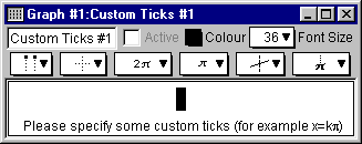
Figure 7.1 shows a blank custom ticks window:

Figure 7.1: A blank custom ticks window
The custom ticks window consists of the following elements:
- a title bar,
- a parameter bar,
- a ticks control bar, and
- some tick specification fields.
| Hint: | The custom ticks window is very similar to the algebraic relation window.
They have the following equivalent elements and properties:
- easy button support when editing constraint specifications,
- the title bar’s elements and functions,
- the parameter bar’s elements and functions,
- the constraint fields’ elements and functions, and
- the optional keystroke field below the current constraint field.
This chapter still provides a complete explanation of these elements and properties
so that the manual has a modular structure and can be used as a reference.
The description for the equivalent elements and properties are mirrored
in the The Algebraic Relation Window chapter. |
|
An easy button floating window is available for help in entering custom ticks
specifications. Easy buttons are especially useful when entering
symbols not readily available from standard keys on a keyboard, such as π, or any powers.
For details, refer to the The Easy Button Floating Window chapter.
We will now discuss each of the elements of the custom ticks window in turn.
- Title bar
- The title bar displays the graph title
and the custom ticks title. The default title, “Custom Ticks #1”, can
be changed using the parameter bar’s title edit box. Figure 7.2 shows the title bar:

Figure 7.2: The title bar of the custom ticks window
- Parameter bar
- The parameter bar is for changing the title, showing and hiding the custom ticks,
modifying the tick’s colour, and
changing the font size used to display the tick’s specification.
Figure 7.3 shows the parameter bar:

Figure 7.3: The parameter bar of the custom ticks window
The elements, from left to right on the custom ticks window parameter bar,
are explained as follows:
- Title edit box
- The title edit box is for changing the title of the current custom ticks specification.
Title editing is useful in demonstrations and for print-outs.
The default title, “Custom Ticks #1”, can be changed
by clicking on the title edit box to access the edit mode.
The new title will be reflected in all GrafEq menus, windows, and buttons
that show the custom tick’s title.
- Active checkbox
- The Active checkbox is for showing and hiding the custom ticks
in all opened graph
view windows.
Clicking on the checkbox, or the checkbox name, toggles between the selected and unselected states.
Deselecting the box hides the custom ticks from all graph views.
| Hint: | The Active checkbox is greyed out and unavailable if
the custom ticks definition is not valid yet. |
|
- Colour pop-up menu
- The Colour pop-up menu is for changing the colour used for the
custom ticks in graph views.
This control is useful for optimizing the clarity of graph views.
The colour can be changed
by clicking on the Colour box to access the pop-up colour menu,
then selecting the desired colour from it.
- Font Size pop-up menu
- The Font Size pop-up menu is for changing the font size used to display the
tick’s specification in the custom ticks window.
The control is useful for presentations via an overhead liquid
crystal display (LCD) or large screen television.
The font size can be changed by
clicking on the Font Size pop-up menu to bring up the
menu of available font sizes, and then selecting the desired size from it.
All constraints used for the tick specification will be
displayed in the selected font size.
| Hint: | Some options in the custom ticks window’s parameter bar do not change
behaviour or appearance within the custom ticks window itself:
- The Active checkbox affects the appearance (custom ticks display) in
graph view windows.
- The Colour pop-up menu affects the appearance (custom ticks colour)
in graph view windows.
|
|
- Ticks control bar
- The ticks control bar is for changing the appearance of custom ticks in all
view window(s) of the associated graph.
The controls are for optimizing the readability of the custom ticks,
and is useful in demonstrations and making print-outs.
Figure 7.4 shows the ticks control bar.

Figure 7.4: The tick control bar of the custom ticks window
The elements, from left to right on the custom ticks window tick control bar,
are explained as follows:
- Labels pop-up menu
- The labels pop-up menu is for changing which ends of the custom tick lines are
labelled. This control does not affect polar views.
Available options include:
- no labels,
- labels on the top (or left),
- labels on the bottom (or right),
- labels alternating between the top and the bottom (or left and right),
- labels alternating between the bottom and the top (or right and left), and
- labels on both the top and bottom (or left and right).
Figure 7.5 shows example views with various label options:

No labels

Labels on the top

Labels on the bottom

Labels alternating between the top and the bottom

Tick labels alternating between the bottom and the top

Labels on both the bottom and the top
Figure 7.5: Example views with various label options
- Line pop-up menu
- The line pop-up menu is for changing the style used to display the custom tick lines.
This control affects both polar and cartesian views. Available options include:
- no lines,
- dotted lines,
- dashed lines, and
- solid lines.
Figure 7.6 shows views with various line options:

No lines

Dotted lines

Dashed lines

Solid lines
Figure 7.6: Views with various line options
- Symbolic simplification pop-up menu
- The symbolic simplification pop-up menu is for changing
how much simplification is to be applied to the custom tick labels.
This control does not affect polar views.
Available options include:
- none, for no simplification;
- bracketed, for simplified presentation of any parts within brackets; and
- complete, for a simplified presentation.
Figure 7.7 shows views with various symbolic simplification options:

No symbolic simplification

Bracketed symbolic simplification

Complete symbolic simplification
Figure 7.7: Views with various symbolic simplification options
- Label font size pop-up menu
- The label font size pop-up menu is for changing the font size
of the tick line labels.
This control does not affect polar views.
Eight sizes are available, ranging from very small fonts to very large fonts.
- Outline pop-up menu
- The outline pop-up menu is for changing the thickness of any outlining
around displayed custom tick lines and labels.
Outlining is useful when parts of the custom ticks are obscured by graph regions.
This control does not affect polar views.
Available options include:
- no outline,
- minimal outline,
- moderate outline, and
- maximal outline.
Figure 7.8 shows views with various outline options:

No outline

Minimal outline

Moderate outline

Maximal outline
Figure 7.8: Views with various outline options
- Display variable pop-up menu
- The display variable pop-up menu is for selecting whether or not
the variable is displayed within tick labels.
This control does not affect polar views.
figure 7.9 shows views with, and without, the variable being displayed:

Variable displayed in labels

Variable not displayed in labels
Figure 7.9: Views with, and without, the variable being displayed
| Hint: | All options in the custom ticks control bar only affect the appearance
of custom ticks in graph view windows. They do not affect
the behaviour or appearance within the custom ticks window itself. |
|
- Custom tick constraint fields
- Custom tick constraint fields are for specifying the custom ticks. They
display the entered specification in standard mathematics notations.
Prompts appear at the bottom of the field, while a constraint is being entered,
to offer basic tips during the specification process.
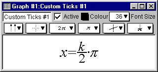
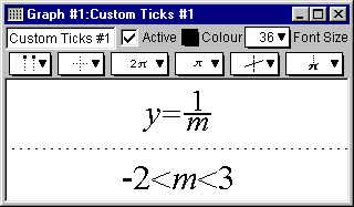
Figure 7.10 shows examples simple and complex custom tick specifications:

|

| |
Simple tick specification
|
Complex tick specification
|
Figure 7.10: Custom ticks windows displaying simple and complex specifications
Custom ticks constraints should be specified in terms of the domain or range variable.
The simple tick specification in figure 7.10 creates vertical ticks in multiples of π/2,
which is especially useful for graphing trigonometric relations. Additional samples of
useful tick specifications are provided at the end of this manual chapter.
While a constraint is being entered or changed,
- prompts appear at the bottom of the constraint field, and
the easy button floating window is available to offer support for
the specification process;
- a blinking cursor is present;
- the Active checkbox of the custom ticks window is unselected, and
greyed out unless all constraints are valid;
- press the Tab key to move to the next constraint,
or to create a new one if there is not a next constraint;
- press the Tab key while holding down the Shift key to move to the previous constraint,
or to create a new one if there is not a previous constraint.
When functions are entered using multiple characters, the characters
are unformatted, and presented in red, until GrafEq recognizes them as a function name:
red signifies unrecognized entries. GrafEq can interpret
“sin” as the sine function, instead of the product “s×i×n”,
only after an argument, such as x, is entered. A good example is the square root function,
when entered as “sqrt”: GrafEq will replace the letters with a graphical
radical symbol after an argument is started.
| Hint: | If the cursor is positioned away from the end of the constraint string
during editing, all characters to the right side of the cursor become unformatted.
With the default preference settings, unformatted characters are
shown in solid red on colour displays, while they are outlined in black
(not filled in) on black-and-white displays.
|
|
| Tip: | The “Symbol” and “Times” TrueType fonts must be installed
in order to produce attractive screen output unless the font settings have been
changed in the preferences. |
|
| Tip: | More information on the format and structure of constraints and
the parser is available in the How GrafEq Works chapter. |
|
7.1 Example Custom Ticks
To better understand the variety of ticks that are possible with custom ticks, we’ll look at some examples
of custom ticks.
- For a single vertical tick line through (π,3), enter x=π.
- For horizontal tick lines through multiples of 1/2π, enter y=k(π/2).
- For “log-paper”, enter x=10k.
- For “cross-hairs”, enter x=π for tick #1, and y=logπ for tick #2.
- For circular ticks, in polar as well as cartesian views, enter r=k.
- For radial ticks, in polar as well as cartesian views, enter θ=k(π/6).
Conclusion
- Custom ticks are usually either domain or range interpretation aids:
For cartesian views, they would be vertical or horizontal lines.
For polar views, they would be radial lines emanating from the origin, or
concentric circles about the origin.
Custom ticks are usually specified in terms of the domain variable or
the range variable. For both cartesian and polar views, custom ticks can
be specified using r or θ.
- Each custom ticks window describes one set of custom ticks; the custom ticks can
be defined using a single constraint, or by using multiple constraints.
Additional constraint fields can be brought up
by pressing the Tab key from within the custom ticks window.
- Each graph can have one or more sets of custom ticks. Each set is described in its own
custom ticks window. Additional custom ticks windows can be opened
by selecting New Custom Ticks... from the Graph menu.
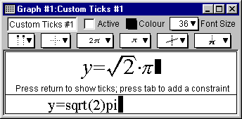
- The keystrokes field is a strip beneath the current constraint field. It shows the
keystrokes used to produce the formatted relation in the
constraint field. Keystrokes information is especially useful when the intuitive mathematics
symbols and notation have no obvious correspondence with the keys on a keyboard, such as
π or any powers.
Figure 7.11 shows a sample keystrokes field with its corresponding constraint field:

Figure 7.11: A custom ticks window with its keystroke field
Prior to version 2.04, GrafEq always provided this information via the keystroke field.
But as of GrafEq 2.04, keystroke information can be revealed within
the constraint fields by positioning the cursor to the left of the entries.
The keystroke field is hidden using the default preferences, but
remains useful for printing purposes.
To display the keystroke field, change the default preference setting.
- A custom tick entry can be completed by selecting the
Active checkbox of its custom ticks window or by pressing return.
When custom tick entries are completed,
the custom tick window will collapse to display just the title bar, parameter bar, ticks
control bar, and
constraint fields - prompts, the blinking cursor, the keystroke field, and the easy button
floating window will disappear. The Active checkbox will be selected, but it can be freely
deselected and selected without editing any constraints.
- Clicking within any constraint field of a completed custom ticks window
will return you to the edit mode and remove the corresponding set of custom ticks
from any opened graph views.
| Tip: | Single tick lines or cross-hairs are desirable especially if memory is low or
only specific regions are of interest. To the custom ticks x=10k,
adding a constraint such as 0<k<4 allows GrafEq
to concentrate on the region of interest.
Further, the relation specification itself might also be modified to stand out
specific regions of interest, in which case GrafEq
need not bother with any custom ticks at all and can concentrate
on graphing the relation. Mastering relation specification would take time and
practise, but it can be done, and it is fun!
|
|
|
|


